The People —
United
Creating a brand for grassroots organizing and activism.
There is incredible work being done by grassroots organizers everywhere — whether it’s climate change, health care, or water justice, people are coming together to demand better. But how should we tell this story?
2021
Council of Canadians
Strategy
Branding & Design
Campaigns & Content
Social Media
Training & Workshops
The Council was seeking to update their visual identity to better align with their emerging ‘story of self’ and the organization renewal taking place. We were asked to design a process for this important next step.
Our work began with an in-depth research process. This included a collaborative workshop and a survey of key stakeholders. We also conducted an environmental scan of peers in the space to identify a unique visual direction.
Online and offline, the communications space is more cluttered than ever. Many voices are competing for attention. The work of progressives is far too important to fade into the background.
This process led us to developing three mood boards, two brand concepts, and ultimately a final selected brand. As the name was to stay the same, we had to ensure the visual direction was bold but not too patriotic or colonial.
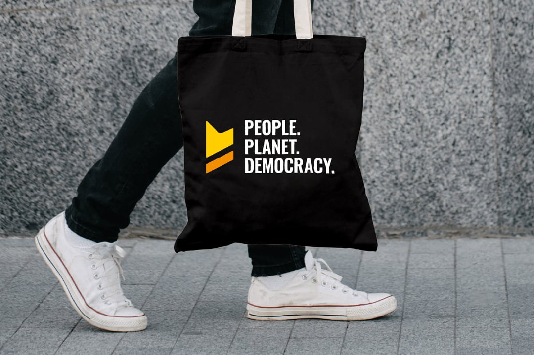
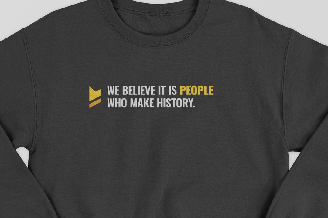
We used yellow as a featured colour in the palette, to act as a warning to anyone who stands in our way. At its core, this brand stands for people, the planet, and our democracy.
Our work is to put people and communities first — by organizing on important issues like climate, water, and public services. We needed a visual identity to help us grow our impact for many years to come. Emdash was key to helping us accomplish this.
— Ravi Joshi, Co-Executive Director and Director
of Communications, Council of Canadians